CSS?CSS3!
Important
- 布局(盒模型、定位、浮动、flex等)[[First floor - 2 CSS#盒子-布局Overflow]]
- 响应式设计
- px/rem/em/vw/wh 的区别
- 选择器[[First floor - 2 CSS#选择器]]、伪类[[First floor - 2 CSS#伪类]]
- 动画、transition
简介
CSS:Cascading Style Sheets
CSS声明:
/*注释*/
p
{
	color : red;
	/*注释*/
	text-align : center;
}
/*id选择器,独一无二(不要以数字开头)*/
#para1
{
	color : red;
	text-align : center;
}
/*class选择器,可以在多个元素中使用(不要以数字开头)*/
.center
{
	text-align : center;
}
当然你还可以,嵌套!
p.center
{
	text-align : center;
}
来一个?CSS创建
三种方式:
外部样式表(External style sheet)
有一个额外的.css文件,适合大部分情况
引用:
<head>
<link rel="stylesheet" type="text/css" href="mystyle.css">
</head>
rel:规定当前文档与被链接文档之间的关系。
type:代表被链接文档的MIME类型。
- MIME类型描述文件的内容类型
- text/html:表示 HTML 文件,
- text/plain:表示纯文本文件。
href: 链接文件
<hr>
css文件:
不能包含任何的html标签,如下
hr
{
	color:sienna;
}
p
{
	margin-left:20px;
}
body
{
	background-image:url("/images/back40.gif");
}
不要在属性值与单位之间留有空格(如"20 px"),正确的写法是 "20px" 。
内部样式表(Internal style sheet)
适合单个文档需要特殊的样式的情况,定义在<style>标签内部
<head>
<style>
hr
{
	color:sienna;
}
p
{
	margin-left:20px;
}
body
{
	background-image:url("/images/back40.gif");
}
</style>
</head>
内联样式(Inline style)
将表现和内容一起,请慎用,适用与仅需要在某个元素上应用一次时
<p style="color:sienna;margin-left:20px">这是一个段落。</p>
多重样式,套娃,小子
/*外部css*/
h3 { color:red; text-align:left; font-size:8pt; }
/*内部样式表*/
<style>
h3 { text-align:right; font-size:20pt; }
</style>
最终得到
color:red;
text-align:right;
font-size:20pt;
优先级
越近越优先
(内联样式)Inline style > (内部样式)Internal style sheet >(外部样式)External style sheet > 浏览器默认样式
[[CSS-多重样式优先级深入概念]]
选择器
分组选择器
h1,h2,p
{
	color:green;
}
相同的可以一起声明
嵌套选择器
p
{
	color:blue;
	text-align:center;
}
.marked
{
	background-color:red;
}
.marked p
{
	color:white;
}
p.marked
{
	text-decoration:underline;
}
- p{ }: 为所有 p 元素指定一个样式。
- .marked{ }: 为所有 class="marked" 的元素指定一个样式。
- .marked p{ }: 为所有 class="marked" 元素内的 p 元素指定一个样式。
- p.marked{ }: 为所有 class="marked" 的 p 元素指定一个样式。
后代选择器
选择所有div中的p元素
div p
{
	background-color:yellow;
}
子元素选择器
只能选择所有div的直接(一级)子p元素
div > p
{
	background-color:yellow;
}
相邻兄弟选择器
选择紧贴div元素后的第一个p元素,它们有共同的父元素
div + p
{
	background-color:yellow;
}
后续兄弟选择器
选择所有div元素后的p元素
div - p
{
	background-color:yellow;
}
属性选择器
html元素属性:定义在尖括号内的内容,如class,id等
[title] {
	color:blue;
}
选择指定要求的属性
/*独立完整包含指定值*/
[title ~= hello]
<img src=".jpg" title="hello world!" />

/*包含指定值,不必独立*/
[title *= hello]
<img src=".jpg" title="hhhhellooooooo" />

/*以独立完整的指定值开头*/
[lang |= en]
<p lang="en">  <p lang="en-us">

/*以指定值开头,不必独立*/
[lang ^= en]
<p lang="ennn">

/*以指定值结尾*/
[src $= .pdf]
<a src="xxx.pdf" />
表单样式
input[type="text"]
{
    width:150px;
    display:block;
    margin-bottom:10px;
    background-color:yellow;
}
input[type="button"]
{
    width:120px;
    margin-left:35px;
    display:block;
}
属性
以下是定义在CSS大括号内的内容
背景
| Property | 描述 |
|---|---|
| background | 简写属性,作用是将背景属性设置在一个声明中。 |
| background-attachment | 背景图像是否固定或者随着页面的其余部分滚动。 |
| background-color | 设置元素的背景颜色。 |
| background-image | 把图像设置为背景。 |
| background-position | 设置背景图像的起始位置。 |
| background-repeat | 设置背景图像是否及如何重复。 |
文本
| 属性 | 描述 |
|---|---|
| color | 设置文本颜色 |
| direction | 设置文本方向。 |
| letter-spacing | 设置字符间距 |
| line-height | 设置行高 |
| text-align | 对齐元素中的文本 |
| text-decoration | 向文本添加修饰 |
| text-indent | 缩进元素中文本的首行 |
| text-shadow | 设置文本阴影 |
| text-transform | 控制元素中的字母 |
| unicode-bidi | 设置或返回文本是否被重写 |
| vertical-align | 设置元素的垂直对齐 |
| white-space | 设置元素中空白的处理方式 |
| word-spacing | 设置字间距 |
字体
| Property | 描述 |
|---|---|
| font | 在一个声明中设置所有的字体属性 |
| font-family | 指定文本的字体系列 |
| font-size | 指定文本的字体大小 |
| font-style | 指定文本的字体样式 |
| font-variant | 以小型大写字体或者正常字体显示文本。 |
| font-weight | 指定字体的粗细。 |
列表
| 属性 | 描述 |
|---|---|
| list-style | 简写属性。用于把所有用于列表的属性设置于一个声明中 |
| list-style-image | 将图像设置为列表项标志。 |
| list-style-position | 设置列表中列表项标志的位置。 |
| list-style-type | 设置列表项标志的类型。 |
盒子模型[!Important]
所有HTML元素都可以看作盒子,具有一些通用的属性
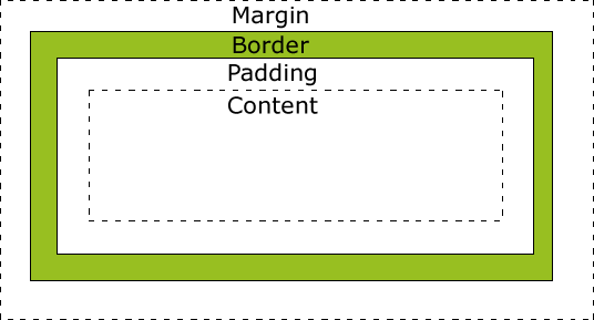
- Margin(外边距) - 清除边框外的区域,外边距是透明的。
- Border(边框) - 围绕在内边距和内容外的边框。
- Padding(内边距) - 清除内容周围的区域,内边距是透明的。
- Content(内容) - 盒子的内容,显示文本和图像。
当您指定一个 CSS 元素的宽度和高度属性时,你只是设置内容区域的宽度和高度。要知道,完整大小的元素,你还必须添加内边距,边框和外边距。
div
{
	width: 300px;
	border: 25px solid green;
	padding: 25px;
	margin: 25px;
}
盒子-边框Border
| 属性 | 描述 |
|---|---|
| border | 简写属性,用于把针对四个边的属性设置在一个声明。 |
| border-style | 用于设置元素所有边框的样式,或者单独地为各边设置边框样式。 |
| border-width | 简写属性,用于为元素的所有边框设置宽度,或者单独地为各边边框设置宽度。 |
| border-color | 简写属性,设置元素的所有边框中可见部分的颜色,或为 4 个边分别设置颜色。 |
| border-bottom | 简写属性,用于把下边框的所有属性设置到一个声明中。 |
| border-bottom-color | 设置元素的下边框的颜色。 |
| border-bottom-style | 设置元素的下边框的样式。 |
| border-bottom-width | 设置元素的下边框的宽度。 |
| border-left | 简写属性,用于把左边框的所有属性设置到一个声明中。 |
| border-left-color | 设置元素的左边框的颜色。 |
| border-left-style | 设置元素的左边框的样式。 |
| border-left-width | 设置元素的左边框的宽度。 |
| border-right | 简写属性,用于把右边框的所有属性设置到一个声明中。 |
| border-right-color | 设置元素的右边框的颜色。 |
| border-right-style | 设置元素的右边框的样式。 |
| border-right-width | 设置元素的右边框的宽度。 |
| border-top | 简写属性,用于把上边框的所有属性设置到一个声明中。 |
| border-top-color | 设置元素的上边框的颜色。 |
| border-top-style | 设置元素的上边框的样式。 |
| border-top-width | 设置元素的上边框的宽度。 |
| border-radius | 设置圆角的边框。 |
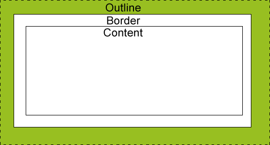
盒子-轮廓Outline
绘制于元素周围的一条线,位于边框边缘的外围,可起到突出元素的作用。
不占空间
| 属性 | 说明 | 值 |
|---|---|---|
| outline | 在一个声明中设置所有的轮廓属性 | outline-color <br>outline-style <br>outline-width <br>inherit |
| outline-color | 设置轮廓的颜色 | color-name <br>hex-number <br>rgb-number <br>invert <br>inherit |
| outline-style | 设置轮廓的样式 | none <br>dotted <br>dashed <br>solid <br>double <br>groove <br>ridge <br>inset <br>outset <br>inherit |
| outline-width | 设置轮廓的宽度 | thin <br>medium <br>thick <br>length <br>inherit |
盒子-外边距Margin
margin清除周围的(外边框)元素区域。margin 没有背景颜色,是完全透明的。
| 属性 | 描述 |
|---|---|
| margin | 简写属性。在一个声明中设置所有外边距属性。 |
| margin-bottom | 设置元素的下外边距。 |
| margin-left | 设置元素的左外边距。 |
| margin-right | 设置元素的右外边距。 |
| margin-top | 设置元素的上外边距。 |
盒子-填充Padding
定义元素边框与元素内容之间的空间,即上下左右的内边距。
| 属性 | 说明 |
|---|---|
| padding | 使用简写属性设置在一个声明中的所有填充属性 |
| padding-bottom | 设置元素的底部填充 |
| padding-left | 设置元素的左部填充 |
| padding-right | 设置元素的右部填充 |
| padding-top | 设置元素的顶部填充 |
盒子-尺寸Dimension
控制元素的高度和宽度,或者增加行间距。
| 属性 | 描述 |
|---|---|
| height | 设置元素的高度。 |
| line-height | 设置行高。 |
| max-height | 设置元素的最大高度。 |
| max-width | 设置元素的最大宽度。 |
| min-height | 设置元素的最小高度。 |
| min-width | 设置元素的最小宽度。 |
| width | 设置元素的宽度。 |
盒子-显示Display
display:none完全隐藏一个元素,不占用任何空间
块和内联元素:[[First floor - 1 HTML#区块div/span]]
display:block/inline改变元素显示方式
盒子-可见性Visibility
visibility:hidden只是看不见内容,依旧占用原本的空间
盒子-定位Position
position的五个值
| 属性 | 说明 | 值 |
|---|---|---|
| bottom | 定位元素下外边距边界与其包含块下边界之间的偏移。 | auto<br>length<br>%<br>inherit |
| clip | 剪辑一个绝对定位的元素 | shape<br>auto<br>inherit |
| cursor | 显示光标移动到指定的类型 | url<br>auto<br>crosshair<br>default<br>pointer<br>move<br>e-resize<br>ne-resize<br>nw-resize<br>n-resize<br>se-resize<br>sw-resize<br>s-resize<br>w-resize<br>text<br>wait<br>help |
| left | 定位元素左外边距边界与其包含块左边界之间的偏移。 | auto<br>length<br>%<br>inherit |
| overflow | 设置当元素的内容溢出其区域时发生的事情。 | auto<br>hidden<br>scroll<br>visible<br>inherit |
| overflow-y | 指定如何处理顶部/底部边缘的内容溢出元素的内容区域 | auto<br>hidden<br>scroll<br>visible<br>no-display<br>no-content |
| overflow-x | 指定如何处理右边/左边边缘的内容溢出元素的内容区域 | auto<br>hidden<br>scroll<br>visible<br>no-display<br>no-content |
| position | 指定元素的定位类型 | absolute <br>fixed<br>relative<br>static<br>inherit |
| right | 定位元素右外边距边界与其包含块右边界之间的偏移。 | auto<br>length<br>%<br>inherit |
| top | 一个定位元素的上外边距边界与其包含块上边界之间的偏移。 | auto<br>length<br>%<br>inherit |
| z-index | 设置元素的堆叠顺序 | number<br>auto<br>inherit |
static
默认值,无定位
不会受到top,bottom,left,right影响。
fixed
元素的位置相对于浏览器窗口固定。
即使窗口滚动也不会移动。
注意: Fixed 定位在 IE7 和 IE8 下需要描述 !DOCTYPE 才能支持。
Fixed定位使元素的位置与文档流无关,因此不占据空间。
Fixed定位的元素和其他元素重叠。
relative
相对于其正常位置的定位(偏移)。
偏移后,其原本正常位置的空间依旧存在。
相对定位元素经常被用来作为绝对定位元素的容器块。
absolute
绝对定位的元素的位置相对于最近的已定位父元素,如果元素没有已定位的父元素,那么它的位置相对于<html>。
元素位置于文档流无关,不占用空间,与其他元素重叠。
sticky
粘贴定位根据用户的滚动在relative和fixed定位之间切换。
正常为position:relative而当页面滚动超出目标区域时,它的表现就像position:fixed,它会固定在目标位置。
必须指定top,right,bottom或left四个阈值其中之一才生效。
重叠次序
z-index属性,具有更高堆叠顺序的元素总是在较低的堆叠顺序元素的前面。
如果两个定位元素重叠,没有指定z - index,最后定位在HTML代码中的元素将被显示在最前面。
盒子-布局Overflow
overflow 属性可以控制内容溢出元素框时在对应的元素区间内添加滚动条。
| 值 | 描述 |
|---|---|
| visible | 默认值。内容不会被修剪,会呈现在元素框之外。 |
| hidden | 内容会被修剪,并且其余内容是不可见的。 |
| scroll | 内容会被修剪,但是浏览器会显示滚动条以便查看其余的内容。 |
| auto | 如果内容被修剪,则浏览器会显示滚动条以便查看其余的内容。 |
| inherit | 规定应该从父元素继承 overflow 属性的值。 |
overflow 属性只工作于指定高度的块元素上。
盒子-浮动Float
使元素向左或向右移动,其周围的元素也会重新排列。
往往用于图像,但它在布局时一样非常有用。
| 属性 | 描述 | 值 |
|---|---|---|
| clear | 指定不允许元素周围有浮动元素。 | left <br>right <br>both <br>none <br>inherit |
| float | 指定一个盒子(元素)是否可以浮动。 | left <br>right <br>none <br>inherit |
如何浮动
元素的水平方向浮动,意味着元素只能左右移动而不能上下移动。
一个浮动元素会尽量向左或向右移动,直到它的外边缘碰到包含框或另一个浮动框的边框为止。
浮动元素之后的元素将围绕它。
浮动元素之前的元素将不会受到影响。
相邻浮动元素
如果你把几个浮动的元素放到一起,如果有空间的话,它们将彼此相邻。
清除浮动
元素浮动之后,周围的元素会重新排列,为了避免这种情况,使用 clear 属性。
clear 属性指定元素两侧不能出现浮动元素。
透明度
rgba(r,g,b,a)
opacity 0-1
布局-对齐
元素对齐
水平居中对齐
.center
{
	margin: auto;
	width: 50%;
}
没有设置width属性或者设置为100%,居中对齐(margin: auto)将不起作用。
左右对齐
使用position
.right
{
	position: absolute;
	right: 0px;
	width: 300px;
}
绝对定位元素会被从正常流中删除,并且能够交叠元素。
当使用position来对齐元素时, 通常<body>元素会设置margin和padding。这样可以避免在不同的浏览器中出现可见的差异。
当使用position属性时,请始终设置!DOCTYPE声明。
使用float
.right
{
	float: right;
	width: 300px;
}
当使用这种方式对齐元素时,最好对<body>元素的外边距和内边距进行预定义。这样可以避免在不同的浏览器中出现可见的差异。
如果子元素的高度大于父元素,且子元素设置了浮动,那么子元素将溢出,这时可以使用"clearfix(清除浮动)"来解决该问题。
在父元素上添加overflow: auto;来解决子元素溢出的问题。
当使用float属性时,请始终设置!DOCTYPE声明。
垂直居中
使用padding
.center
{
	padding: 70px 0;
}
使用line-height
.center
{
	line-height: 200px;
	height: 200px;
}
/*文本多行*/
.center p
{
	line-height: 1.5;
	display: inline-block;
	vertical-align: middle;
}
使用position和transform
.center
{
	height: 200px;
	position: relative;
}

.center p
{
	margin: 0;
	position: absolute;
	top: 50%;
	left: 50%;
	transform: translate(-50%, -50%);
}
文本水平居中对齐
.center
{
	text-align: center;
}
图片水平居中对齐
img
{
	display: block;
	margin: auto;
	width: 40%;
}
伪类
为元素添加一些选择器的特殊效果。按照正常的css看,伪类修饰前面的元素
语法
内联:
selector:pseudo-class {property:value;}
CSS:
selector.class:pseudo-class {property:value;}
anchor伪类
/*未访问的link*/
a:link {...}
/*已访问的link*/
a:visited {...}
/*鼠标悬停的link*/
a:hover {...}
/*已选中(鼠标点击后)的link*/
a:active {...}
在CSS定义中,a:hover 必须被置于 a:link 和 a:visited 之后,才有效。
a:active 必须被置于 a:hover 之后,才有效。
伪类的名称不区分大小写。
伪类与CSS类
css的选择器语法可搭配伪类使用
a.red:visited
{
	color:#FF0000;
}

<a class="red" herf=""></a>
伪类 first-child
选择父元素的第一个子元素
/*选择任意元素的第一个子元素的p元素*/
p:first-child
{
	color:blue;
}
/*选择任意p元素的第一个子元素的i元素*/
p > i:first-child
{
	color:blue;
}
/*选择作为第一个子元素的p元素中的所有i元素*/
p:first-child i
{
	color:blue;
}
伪类 lang
为不同的语言定义特殊的规则
q:lang(no)
{
	quotes: "~" "~";
}
q:lang(yes)
{
	quotes: ;
}
<!-- nnnn将会被~引起来,yyyy将会被"引起来 -->
<p>xxxx<q lang="no">nnnn</q>xxxx<q lang="yes">yyyy</q></p>
伪类及伪元素 其他
| 选择器 | 示例 | 示例说明 |
|---|---|---|
| :checked | input:checked | 选择所有选中的表单元素 |
| :disabled | input:disabled | 选择所有禁用的表单元素 |
| :empty | p:empty | 选择所有没有子元素的p元素 |
| :enabled | input:enabled | 选择所有启用的表单元素 |
| :first-of-type | p:first-of-type | 选择的每个 p 元素是其父元素的第一个 p 元素 |
| :in-range | input:in-range | 选择元素指定范围内的值 |
| :invalid | input:invalid | 选择所有无效的元素 |
| :last-child | p:last-child | 选择所有p元素的最后一个子元素 |
| :last-of-type | p:last-of-type | 选择每个p元素是其母元素的最后一个p元素 |
| :not(selector) | :not(p) | 选择所有p以外的元素 |
| :nth-child(n) | p:nth-child(2) | 选择所有 p 元素的父元素的第二个子元素 |
| :nth-last-child(n) | p:nth-last-child(2) | 选择所有p元素倒数的第二个子元素 |
| :nth-last-of-type(n) | p:nth-last-of-type(2) | 选择所有p元素倒数的第二个为p的子元素 |
| :nth-of-type(n) | p:nth-of-type(2) | 选择所有p元素第二个为p的子元素 |
| :only-of-type | p:only-of-type | 选择所有仅有一个子元素为p的元素 |
| :only-child | p:only-child | 选择所有仅有一个子元素的p元素 |
| :optional | input:optional | 选择没有"required"的元素属性 |
| :out-of-range | input:out-of-range | 选择指定范围以外的值的元素属性 |
| :read-only | input:read-only | 选择只读属性的元素属性 |
| :read-write | input:read-write | 选择没有只读属性的元素属性 |
| :required | input:required | 选择有"required"属性指定的元素属性 |
| :root | root | 选择文档的根元素 |
| :target | #news:target | 选择当前活动#news元素(点击URL包含锚的名字) |
| :valid | input:valid | 选择所有有效值的属性 |
| :link | a:link | 选择所有未访问链接 |
| :visited | a:visited | 选择所有访问过的链接 |
| :active | a:active | 选择正在活动链接 |
| :hover | a:hover | 把鼠标放在链接上的状态 |
| :focus | input:focus | 选择元素输入后具有焦点 |
| ::first-letter | p::first-letter | 选择每个<p> 元素的第一个字母 |
| ::first-line | p::first-line | 选择每个<p> 元素的第一行 |
| :first-child | p:first-child | 选择器匹配属于任意元素的第一个子元素的 <p> 元素 |
| ::before | p::before | 在每个<p>元素之前插入内容 |
| ::after | p::after | 在每个<p>元素之后插入内容 |
| :lang(language) | p:lang(it) | 为<p>元素的lang属性选择一个开始值 |
伪元素
伪类与伪元素区别
伪类是选择器的一种,用于选择处于特定状态的元素,比如当它们是这一类型的第一个元素时,或者是当鼠标指针悬浮在元素上面的时候。例如,:hover伪类可以用来描述用户悬停在元素上时的状态。
伪元素则用于创建一些不在DOM树中的元素,并为其添加样式。例如,我们可以通过::before来在一个元素之前添加一些文本,并为这些文本添加样式。
总的来说,伪类的操作对象是文档树中已有的元素,而伪元素则创建了一个文档树外的元素。因此,伪类与伪元素的区别在于:有没有创建一个文档树之外的元素。
在CSS3规范中,伪元素使用双冒号(::)表示,以此来区分伪类和伪元素。例如,::before和::after等伪元素使用双冒号(::),:hover和:active伪类使用单冒号(:)。但是,除了少部分伪元素如::backdrop必须使用双冒号(::),大部分伪元素都支持单冒号和双冒号的写法。
伪元素 first-line
为文本的首行设置特殊样式
p::first-line
{
	color:#FF0000;
	font-variant:small-caps;
}
first-line只能用于块级元素
下面的属性可用于first-line
font properties
color properties
background properties
word-spacing
letter-spacing
text-decoration
vertical-align
text-transform
line-height
clear
伪元素 first-letter
设置首字母的特殊样式
p:first-letter
{
	color:#FF0000;
	font-size:xx-large;
}
first-letter只能用于块级元素。
下面的属性可应用于first-letter
font properties
color properties
background properties
margin properties
padding properties
border properties
text-decoration
vertical-align (only if "float" is "none")
text-transform
line-height
float
clear
伪元素与CSS类
p.article::first-letter
{
	color:#FF0000;
}
伪元素结合
p::first-letter
{
	color:#FF0000;
	font-size:xx-large;
}
p::first-line
{
	color:#0000FF;
	font-variant:small-caps;
}
伪元素 before
在元素前面插入内容
/*在每个h1元素前插入图片*/
h1::before
{
	content:url(xx.gif);
}
伪元素 after
在元素后面插入内容
/*在每个h1元素后插入图片*/
h1::after
{
	content:url(xx.gif);
}
CSS设计
导航栏
垂直导航栏
ul {
	/*移除列表前标志,取消边距和填充*/
	list-style-type: none;
	margin: 0;
	padding: 0;
	/*边框*/
	border: 1px solid #555;
	/*全部高度固定导航条*/
	width: 25%;
	background-color: #f1f1f1;
	height: 100%;
	position: fixed;
	overflow: auto;
}
a {
	/*将展示方式改为块级,整体变为可点击链接区域,并允许指定宽度*/
	display: block;
	width: 60px;
}
li {
	/*居中,边框*/
	text-align: center;
	border-bottom: 1px solid #555;
}
li::last-child {
	border-bottom: none;
}
li a:hover {
	/*悬停背景颜色*/
	background-color: #555;
	color: white;
}
li a:active {
	/*激活背景颜色*/
	background-color: #4CAF50;
	color: white;
}
<ul>
	<li><a href="#home">主页</a></li>
	<li><a href="#news">新闻</a></li>
	<li><a href="#contact">联系</a></li>
	<li><a href="#about">关于</a></li>
</ul>
水平导航栏
ul {
	list-style-type: none;
	margin: 0;
	padding: 0;
	overflow: hidden;
	background-color: #333;
	/*固定导航条*/
	position: fixed;
	top: 0;
	width: 100%;
}
li {
	/*浮动,彼此相邻*/
	float: left;
}
li a {
	/*将展示方式改为块级,整体变为可点击链接区域,并允许指定宽度*/
	display: block;
	width: 60px;
	/*居中,取消下划线...*/
	color: white;
	text-align: center;
	padding: 14px 16ps;
	text-decoration: none;
}
li a:hover {
	background-color: #111;
}
<ul>
	<li><a href="#home">主页</a></li>
	<li><a href="#news">新闻</a></li>
	<li><a href="#contact">联系</a></li>
	<li style="float:right"><a href="#about">关于</a></li>
</ul>
下拉菜单
.dropdown {
	position: relative;
	display: inline-block;
}
.dropbtn {
	background-color: #4CAF50;
	color: white;
	padding: 16px;
	font-size: 16px;
	border: none;
	cursor: pointer;
}
.dropdown-content {
	display: none;
	position: absoluta;
	background-color: #F9F9F9;
	min-width: 160px;
	box-shadow: 0px 8px 16px 0px rgba(0,0,0,0.2);
}
.dropdown-content a {
	color: black;
	padding: 12px 16px;
	text-decoration: none;
	display: block;
}
.dropdown-content a:hover {
	background-color: #F1F1F1;
}
.dropdown:hover .dropdown-content {
	display: block;
}
.dropdown:hover .dropbtn {
	background-color: #3E8E41;
}
<div class="dropdown">
	<button class="dropbtn">下拉菜单</button>
	<div class="dropdown-content">
		<a herf="#">菜单1</a>
		<a herf="#">菜单2</a>
		<a herf="#">菜单3</a>
	</div>
</div>
提示框
.tooltip {
	position: relative;
	display: inline-block;
	border-bottom: 1px dotted black;
}
.tooltip .tooltiptext {
	visibility: hidden;
	width: 12px;
	background-color: black;
	color: #fff;
	text-align: center;
	padding: 5px 0;
	border-radius: 6px;

	position: absolute;
	z-index: 1;
}
.tooltip:hover .tooltiptext {
	visibility: visible;
}
/*
显示在左/右侧,top根据padding修改
.tooltip .tooltiptext {
    top: -5px;
    right: 105%;
}
.tooltip .tooltiptext {
    top: -5px;
    left: 105%;
}
*/
/*
显示在上/下侧,margin-left根据宽度 (120/2 = 60)修改
.tooltip .tooltiptext {
    width: 120px;
    bottom: 100%;
    left: 50%;
    margin-left: -60px;
}
.tooltip .tooltiptext {
    width: 120px;
    top: 100%;
    left: 50%;
    margin-left: -60px;
}
*/
<div class="tooltip">
	提示
	<span class="tooltiptext">提示文本</span>
</div>
图片廊
<div class="responsive">
  <div class="img">
    <a target="_blank" href="img_fjords.jpg">
      <img src=".jpg" alt="Trolltunga Norway" width="300" height="200">
    </a>
    <div class="desc">图片文本描述</div>
  </div>
</div>

<div class="responsive">
  <div class="img">
    <a target="_blank" href="img_forest.jpg">
      <img src=".jpg" alt="Forest" width="600" height="400">
    </a>
    <div class="desc">图片文本描述</div>
  </div>
</div>

<div class="responsive">
  <div class="img">
    <a target="_blank" href="img_lights.jpg">
      <img src=".jpg" alt="Northern Lights" width="600" height="400">
    </a>
    <div class="desc">图片文本描述</div>
  </div>
</div>

<div class="responsive">
  <div class="img">
    <a target="_blank" href="img_mountains.jpg">
      <img src=".jpg" alt="Mountains" width="600" height="400">
    </a>
    <div class="desc">这里添加图片文本描述</div>
  </div>
</div>

<div class="clearfix"></div>

<div style="padding:6px;">

  <h4>重置浏览器大小查看效果</h4>
</div>
媒体类型
@media 规则[!important]
响应式设计的核心
@media screen
{
    p.test {font-family:verdana,sans-serif;font-size:14px;}
}
@media print
{
    p.test {font-family:times,serif;font-size:10px;}
}
@media screen,print
{
    p.test {font-weight:bold;}
}
| 媒体类型 | 描述 |
|---|---|
| all | 用于所有的媒体设备。 |
| aural | 用于语音和音频合成器。 |
| braille | 用于盲人用点字法触觉回馈设备。 |
| embossed | 用于分页的盲人用点字法打印机。 |
| handheld | 用于小的手持的设备。 |
| 用于打印机。 | |
| projection | 用于方案展示,比如幻灯片。 |
| screen | 用于电脑显示器。 |
| tty | 用于使用固定密度字母栅格的媒体,比如电传打字机和终端。 |
| tv | 用于电视机类型的设备。 |
响应式表单
<!DOCTYPE html>
<html>
<head>
<style>
* {
  box-sizing: border-box;
}

input[type=text], select, textarea {
  width: 100%;
  padding: 12px;
  border: 1px solid #ccc;
  border-radius: 4px;
  resize: vertical;
}

label {
  padding: 12px 12px 12px 0;
  display: inline-block;
}

input[type=submit] {
  background-color: #4CAF50;
  color: white;
  padding: 12px 20px;
  border: none;
  border-radius: 4px;
  cursor: pointer;
  float: right;
}

input[type=submit]:hover {
  background-color: #45a049;
}

.container {
  border-radius: 5px;
  background-color: #f2f2f2;
  padding: 20px;
}

.col-25 {
  float: left;
  width: 25%;
  margin-top: 6px;
}

.col-75 {
  float: left;
  width: 75%;
  margin-top: 6px;
}

/* 清除浮动 */
.row:after {
  content: "";
  display: table;
  clear: both;
}

/* 响应式布局 layout - 在屏幕宽度小于 600px 时, 设置为上下堆叠元素 */
@media screen and (max-width: 600px) {
  .col-25, .col-75, input[type=submit] {
    width: 100%;
    margin-top: 0;
  }
}
</style>
</head>
<body>

<h2>响应式表单</h2>
<p>响应式表带可以根据浏览器窗口的大小重新布局各个元素,我们可以通过重置浏览器窗口大小来查看效果:</p>

<div class="container">
  <form action="/action_page.php">
  <div class="row">
    <div class="col-25">
      <label for="fname">First Name</label>
    </div>
    <div class="col-75">
      <input type="text" id="fname" name="firstname" placeholder="Your name..">
    </div>
  </div>
  <div class="row">
    <div class="col-25">
      <label for="lname">Last Name</label>
    </div>
    <div class="col-75">
      <input type="text" id="lname" name="lastname" placeholder="Your last name..">
    </div>
  </div>
  <div class="row">
    <div class="col-25">
      <label for="country">Country</label>
    </div>
    <div class="col-75">
      <select id="country" name="country">
        <option value="australia">Australia</option>
        <option value="canada">Canada</option>
        <option value="usa">USA</option>
      </select>
    </div>
  </div>
  <div class="row">
    <div class="col-25">
      <label for="subject">Subject</label>
    </div>
    <div class="col-75">
      <textarea id="subject" name="subject" placeholder="Write something.." style="height:200px"></textarea>
    </div>
  </div>
  <div class="row">
    <input type="submit" value="Submit">
  </div>
  </form>
</div>

</body>
</html>
计数器
自动编号
CSS 计数器属性:
counter-reset- 创建或者重置计数器counter-increment- 递增变量content- 插入生成的内容counter()或counters()函数 - 将计数器的值添加到元素
使用 CSS 计数器,先counter-reset创建:
body {
  counter-reset: section;
}

h2::before {
  counter-increment: section;
  content: "Section " counter(section) ": ";
}
嵌套计数器
body {
  counter-reset: section;
}

h1 {
  counter-reset: subsection;
}

h1::before {
  counter-increment: section;
  content: "Section " counter(section) ". ";
}

h2::before {
  counter-increment: subsection;
  content: counter(section) "." counter(subsection) " ";
}
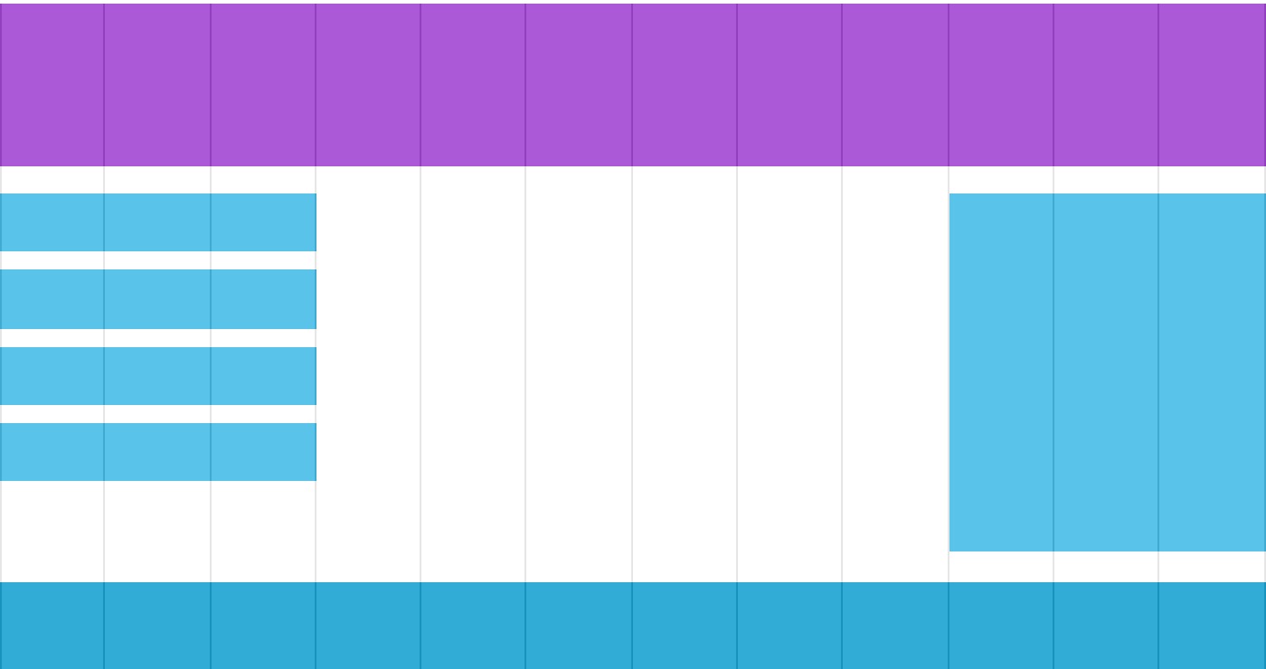
网页布局(yeah~)
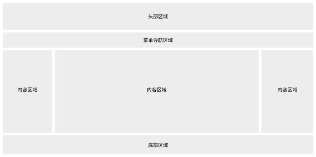
头部
一般用于设置网页的标题,logo。
.header {
	background-color: #F1F1F1;
	text-align: center;
	padding: 20px;
}
菜单导航
包含一些链接。
.topnav {
	overflow: hidden;
	background-color: #333;
}
.topnav a {
	float: left;
	display: block;
	color: #f2f2f2;
	text-align: center;
	padding: 14px, 16px;
	text-decoration: none;
}
.topnav a:hover {
	background-color: #ddd;
	color: black;
}
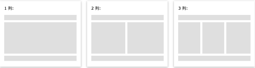
内容区域
三种形式:单列通常用于移动端,双列通常用于平板设备,三列通常用于PC端。
.column {
	float: left;
	width: 33.33%;
}
/*列后清除浮动*/
.row:after {
	content: "";
	display: table;
	clear: both;
}
@media screen and (max-width: 600px) {
.column {
	width: 100%;
}
}
不相等的列,通常中间块最大,两边作导航,加起来总宽度100%。
.column {
	float: left;
}
.column .side {
	width: 25%;
}
.column .middle {
	width: 50%;
}
@media screen and (max-width: 600px) {
.column .side, .column .middle {
	width: 100%;
}
}
底部区域
一般包含版权信息和联系方式等。
.footer {
	background-color: #f1f1f1;
	text-align: center;
	padding: 10px;
}
响应式Web设计
Viewport
viewport(视区) 是用户网页的可视区域。
手机浏览器把页面放在一个虚拟的"窗口"(viewport)中,通常viewport比屏幕宽,不用把每个网页挤到很小的窗口中(会破坏没有针对手机浏览器优化的网页的布局),用户可以通过平移和缩放来看网页的不同部分。
设置viewport
一个常用的针对移动网页优化过的页面的 viewport meta 标签
<meta name="viewport" content="width=device-width, initial-scale=1.0">
- width:控制 viewport 的大小,可以指定的一个值,如 600,或者特殊的值,如 device-width 为设备的宽度(单位为缩放为 100% 时的 CSS 的像素)。
- height:和 width 相对应,指定高度。
- initial-scale:初始缩放比例,也即是当页面第一次 load 的时候缩放比例。
- maximum-scale:允许用户缩放到的最大比例。
- minimum-scale:允许用户缩放到的最小比例。
- user-scalable:用户是否可以手动缩放。
网格视图
响应式网格视图通常是 12 列,宽度为100%,在浏览器窗口大小调整时会自动伸缩。
创建响应式网格视图
确保所有的html元素都有box-sizing属性并且设置为border-box。边距和边框包含在元素的宽度和高度间。
* {
	box-sizing: border-box;
}
12 列的网格系统可以更好的控制响应式网页。
首先我们可以计算每列的百分比: 100% / 12 列 = 8.33%。
在每列中指定 class,用于定义每列有几个 span :
.col-1 {width: 8.33%;}
.col-2 {width: 16.66%;}
.col-3 {width: 25%;}
.col-4 {width: 33.33%;}
.col-5 {width: 41.66%;}
.col-6 {width: 50%;}
.col-7 {width: 58.33%;}
.col-8 {width: 66.66%;}
.col-9 {width: 75%;}
.col-10 {width: 83.33%;}
.col-11 {width: 91.66%;}
.col-12 {width: 100%;}
所有的列向左浮动,间距(padding) 为 15px:
[class*="col-"] {
	float: left;
	padding: 15px;
	border: 1px solid red;
}
每一行使用 <div> 包裹。所有列数加起来应为 12:
<div class="row">
  <div class="col-3">...</div>
  <div class="col-9">...</div>
</div>
媒体查询
@media 查询可以针对不同的媒体类型定义不同的样式。
添加断点
在设计稿的中间添加断点,不同的断点有不同的效果。
在 768px 添加断点:
/* For desktop: */
.col-1 {width: 8.33%;}
.col-2 {width: 16.66%;}
.col-3 {width: 25%;}
.col-4 {width: 33.33%;}
.col-5 {width: 41.66%;}
.col-6 {width: 50%;}
.col-7 {width: 58.33%;}
.col-8 {width: 66.66%;}
.col-9 {width: 75%;}
.col-10 {width: 83.33%;}
.col-11 {width: 91.66%;}
.col-12 {width: 100%;}
@media only screen and (max-width: 768px) {
/* For mobile phones: */
[class*="col-"] {
	width: 100%;
}
}
为移动端优先设计
/* 为移动端设计: */
[class*="col-"] {
	width: 100%;
}
@media only screen and (min-width: 768px) {
/* For desktop: */
.col-1 {width: 8.33%;}
.col-2 {width: 16.66%;}
.col-3 {width: 25%;}
.col-4 {width: 33.33%;}
.col-5 {width: 41.66%;}
.col-6 {width: 50%;}
.col-7 {width: 58.33%;}
.col-8 {width: 66.66%;}
.col-9 {width: 75%;}
.col-10 {width: 83.33%;}
.col-11 {width: 91.66%;}
.col-12 {width: 100%;}
}
其他断点
可为平板添加断点:
/* For mobile phones: */
[class*="col-"] {
	width: 100%;
}
@media only screen and (min-width: 600px) {
/* For tablets: */
.col-m-1 {width: 8.33%;}
.col-m-2 {width: 16.66%;}
.col-m-3 {width: 25%;}
.col-m-4 {width: 33.33%;}
.col-m-5 {width: 41.66%;}
.col-m-6 {width: 50%;}
.col-m-7 {width: 58.33%;}
.col-m-8 {width: 66.66%;}
.col-m-9 {width: 75%;}
.col-m-10 {width: 83.33%;}
.col-m-11 {width: 91.66%;}
.col-m-12 {width: 100%;}
}
@media only screen and (min-width: 768px) {
/* For desktop: */
.col-1 {width: 8.33%;}
.col-2 {width: 16.66%;}
.col-3 {width: 25%;}
.col-4 {width: 33.33%;}
.col-5 {width: 41.66%;}
.col-6 {width: 50%;}
.col-7 {width: 58.33%;}
.col-8 {width: 66.66%;}
.col-9 {width: 75%;}
.col-10 {width: 83.33%;}
.col-11 {width: 91.66%;}
.col-12 {width: 100%;}
}
横屏竖屏
结合CSS媒体查询,可以创建适应不同设备的方向(横屏landscape、竖屏portrait等)的布局。
orientation:portrait | landscape
- portrait: 指定输出设备中的页面可见区域高度大于或等于宽度。
- landscape: 除portrait值情况外,都是landscape。
@media only screen and (orientation: landscape) {
body {
	background-color: lightblue;
}
}
图片
使用 width 属性
如果 width 属性设置为 100%,图片会根据上下范围实现响应式功能
img {
    width: 100%;
    height: auto;
}
如果 max-width 属性设置为 100%, 图片永远不会大于其原始大小
img {
    max-width: 100%;
    height: auto;
}
背景图片
如果 background-size 属性设置为 "contain", 背景图片将按比例自适应内容区域。图片保持其比例不变:
div {
    width: 100%;
    height: 400px;
    background-image: url('img_flowers.jpg');
    background-repeat: no-repeat;
    background-size: contain;
    border: 1px solid red;
}
如果 background-size 属性设置为 "100% 100%" ,背景图片将延展覆盖整个区域:
div {
    width: 100%;
    height: 400px;
    background-image: url('img_flowers.jpg');
    background-size: 100% 100%;
    border: 1px solid red;
}
如果 background-size 属性设置为 "cover",则会把背景图像扩展至足够大,以使背景图像完全覆盖背景区域。注意该属性保持了图片的比例因此 背景图像的某些部分无法显示在背景定位区域中。
div {
    width: 100%;
    height: 400px;
    background-image: url('img_flowers.jpg');
    background-size: cover;
    border: 1px solid red;
}
[[First floor - 1 HTML#HTML5 <picture> 元素]]
视频
如果 width 属性设置为 100%,视频播放器会根据屏幕大小自动调整比例:
video {
    width: 100%;
    height: auto;
}
如果 max-width 属性设置为 100%, 视频播放器会根据屏幕自动调整比例,但不会超过其原始大小:
video {
    max-width: 100%;
    height: auto;
}
在网页中添加视频。根据 div 区域大小自动调整并占满整个 div 区域:
video {
    width: 100%;
    height: auto;
}
CSS3
边框
| 属性 | 说明 |
|---|---|
| border-image | 设置所有边框图像的速记属性。 |
| border-radius | 一个用于设置所有四个边框- *-半径属性的速记属性 |
| box-shadow | 附加一个或多个下拉框的阴影 |
border-radius:25px;
box-shadow: 10px 10px 5px #888888;
圆角
- 四个值: 第一个值为左上角,第二个值为右上角,第三个值为右下角,第四个值为左下角。
- 三个值: 第一个值为左上角, 第二个值为右上角和左下角,第三个值为右下角
- 两个值: 第一个值为左上角与右下角,第二个值为右上角与左下角
- 一个值: 四个圆角值相同
椭圆圆角
border-radius: 50px/15px;
border-radius: 15px/50px;
border-radius: 50%;
| 属性 | 描述 |
|---|---|
| border-radius | 所有四个边角 border---radius 属性的缩写 |
| border-top-left-radius | 定义了左上角的弧度 |
| border-top-right-radius | 定义了右上角的弧度 |
| border-bottom-right-radius | 定义了右下角的弧度 |
| border-bottom-left-radius | 定义了左下角的弧度 |
背景
| 顺序 | 描述 |
|---|---|
| background-clip | 规定背景的绘制区域。 |
| background-origin | 规定背景图片的定位区域。 |
| background-size | 规定背景图片的尺寸。 |
渐变
- 线性渐变(Linear Gradients)- 向下/向上/向左/向右/对角方向
- 径向渐变(Radial Gradients)- 由它们的中心定义
语法:
background-image: linear-gradient(direction, color-stop1, color-stop2, ...);
/*任意角度*/
background-image: linear-gradient(angle, color-stop1, color-stop2);
/*不透明度*/
background-image: linear-gradient(to right, rgba(255,0,0,0), rgba(255,0,0,1));
/*径向渐变*/
background-image: radial-gradient(shape size at position, start-color, ..., last-color);
文本效果
text-shadow: 5px 5px 5px #FF0000;
box-shadow: 10px 10px 5px #888888;
| 属性 | 描述 |
|---|---|
| hanging-punctuation | 规定标点字符是否位于线框之外。 |
| punctuation-trim | 规定是否对标点字符进行修剪。 |
| text-align-last | 设置如何对齐最后一行或紧挨着强制换行符之前的行。 |
| text-emphasis | 向元素的文本应用重点标记以及重点标记的前景色。 |
| text-justify | 规定当 text-align 设置为 "justify" 时所使用的对齐方法。 |
| text-outline | 规定文本的轮廓。 |
| text-overflow | 规定当文本溢出包含元素时发生的事情。 |
| text-shadow | 向文本添加阴影。 |
| text-wrap | 规定文本的换行规则。 |
| word-break | 规定非中日韩文本的换行规则。 |
| word-wrap | 允许对长的不可分割的单词进行分割并换行到下一行。 |
字体
@font-face规则:字体文件包含在网站中,它会自动下载给需要的用户。
@font-face {
    font-family: myFirstFont;
    src: url(sansation_light.woff);
}
/*使用粗体*/
@font-face {
	font-family: myFirstFont;
	src: url(sansation_bold.woff);
	font-weight:bold;
}
div {
    font-family:myFirstFont;
}
| 描述符 | 值 | 描述 |
|---|---|---|
| font-family | name | 必需。规定字体的名称。 |
| src | URL | 必需。定义字体文件的 URL。 |
| font-stretch | - normal<br>- condensed<br>- ultra-condensed<br>- extra-condensed<br>- semi-condensed<br>- expanded<br>- semi-expanded<br>- extra-expanded<br>- ultra-expanded | 可选。定义如何拉伸字体。默认是 "normal"。 |
| font-style | - normal<br>- italic<br>- oblique | 可选。定义字体的样式。默认是 "normal"。 |
| font-weight | - normal<br>- bold<br>- 100<br>- 200<br>- 300<br>- 400<br>- 500<br>- 600<br>- 700<br>- 800<br>- 900 | 可选。定义字体的粗细。默认是 "normal"。 |
| unicode-range | unicode-range | 可选。定义字体支持的 UNICODE 字符范围。默认是 "U+0-10FFFF"。 |
转换
2D转换
- translate()
- rotate()
- scale()
- skew()
- matrix()
translate()
/*右50px,下100px*/
transform: translate(50px, 100px);
rotate()
/*顺时针旋转30度*/
transform: rotate(30deg);
scale()
/*宽*2,高*3*/
transform: scale(2, 3);
skew()
/*x方向上扭曲30度,y方向上扭曲20度*/
transform: skew(30deg, 20deg);
matrix()
三合一(无rotate)
transform: matrix(scaleX,skewY,skewX,scaleY,translateX,translateY)
| 函数 | 描述 |
|---|---|
| matrix(n,n,n,n,n,n) | 定义 2D 转换,使用六个值的矩阵。 |
| translate(x,y) | 定义 2D 转换,沿着 X 和 Y 轴移动元素。 |
| translateX(n) | 定义 2D 转换,沿着 X 轴移动元素。 |
| translateY(n) | 定义 2D 转换,沿着 Y 轴移动元素。 |
| scale(x,y) | 定义 2D 缩放转换,改变元素的宽度和高度。 |
| scaleX(n) | 定义 2D 缩放转换,改变元素的宽度。 |
| scaleY(n) | 定义 2D 缩放转换,改变元素的高度。 |
| rotate(angle) | 定义 2D 旋转,在参数中规定角度。 |
| skew(x-angle,y-angle) | 定义 2D 倾斜转换,沿着 X 和 Y 轴。 |
| skewX(angle) | 定义 2D 倾斜转换,沿着 X 轴。 |
| skewY(angle) | 定义 2D 倾斜转换,沿着 Y 轴。 |
| Property | 描述 |
|---|---|
| transform | 适用于2D或3D转换的元素 |
| transform-origin | 允许您更改转化元素位置 |
3D转换
rotateX()
/*绕x轴3d旋转*/
transform: rotateX(120deg);
rotateY()
/*绕y轴3d旋转*/
transform: rotateY(120deg);
| 属性 | 描述 |
|---|---|
| transform | 向元素应用 2D 或 3D 转换。 |
| transform-origin | 允许你改变被转换元素的位置。 |
| transform-style | 规定被嵌套元素如何在 3D 空间中显示。 |
| perspective | 规定 3D 元素的透视效果。 |
| perspective-origin | 规定 3D 元素的底部位置。 |
| backface-visibility | 定义元素在不面对屏幕时是否可见。 |
| 函数 | 描述 |
|---|---|
| matrix3d(n,n,n,n,n,n, <br>n,n,n,n,n,n,n,n,n,n) | 定义 3D 转换,使用 16 个值的 4x4 矩阵。 |
| translate3d(x,y,z) | 定义 3D 转化。 |
| translateX(x) | 定义 3D 转化,仅使用用于 X 轴的值。 |
| translateY(y) | 定义 3D 转化,仅使用用于 Y 轴的值。 |
| translateZ(z) | 定义 3D 转化,仅使用用于 Z 轴的值。 |
| scale3d(x,y,z) | 定义 3D 缩放转换。 |
| scaleX(x) | 定义 3D 缩放转换,通过给定一个 X 轴的值。 |
| scaleY(y) | 定义 3D 缩放转换,通过给定一个 Y 轴的值。 |
| scaleZ(z) | 定义 3D 缩放转换,通过给定一个 Z 轴的值。 |
| rotate3d(x,y,z,angle) | 定义 3D 旋转。 |
| rotateX(angle) | 定义沿 X 轴的 3D 旋转。 |
| rotateY(angle) | 定义沿 Y 轴的 3D 旋转。 |
| rotateZ(angle) | 定义沿 Z 轴的 3D 旋转。 |
| perspective(n) | 定义 3D 转换元素的透视视图。 |
过渡
/*transition: 属性,时间,时间曲线,延迟*/
transition: width 2s, height 2s, transform 2s;
| 属性 | 描述 |
|---|---|
| transition | 简写属性,用于在一个属性中设置四个过渡属性。 |
| transition-property | 规定应用过渡的 CSS 属性的名称。 |
| transition-duration | 定义过渡效果花费的时间。默认是 0。 |
| transition-timing-function | 规定过渡效果的时间曲线。默认是 "ease"。 |
| transition-delay | 规定过渡效果何时开始。默认是 0。 |
动画
@keyframes name {
	from == 0% {

	}
	to == 100% {

	}
	any% {

	}
}
div {
	animation: name 5s;
}
| 属性 | 描述 |
|---|---|
| @keyframes | 规定动画。 |
| animation | 所有动画属性的简写属性。 |
| animation-name | 规定 @keyframes 动画的名称。 |
| animation-duration | 规定动画完成一个周期所花费的秒或毫秒。默认是 0。 |
| animation-timing-function | 规定动画的速度曲线。默认是 "ease"。 |
| animation-fill-mode | 规定当动画不播放时(当动画完成时,或当动画有一个延迟未开始播放时),要应用到元素的样式。 |
| animation-delay | 规定动画何时开始。默认是 0。 |
| animation-iteration-count | 规定动画被播放的次数。默认是 1。 |
| animation-direction | 规定动画是否在下一周期逆向地播放。默认是 "normal"。 |
| animation-play-state | 规定动画是否正在运行或暂停。默认是 "running"。 |
多列
div {
	column-count: 3;
	column-gap: 40px;
	/*列边框*/
	column-rule-style: solid;
	column-rule-width: 1px;
}
h2 {
	/*指定元素跨列*/
	column-span: all;
}
| 属性 | 描述 |
|---|---|
| column-count | 指定元素应该被分割的列数。 |
| column-fill | 指定如何填充列 |
| column-gap | 指定列与列之间的间隙 |
| column-rule | 所有 column-rule-* 属性的简写 |
| column-rule-color | 指定两列间边框的颜色 |
| column-rule-style | 指定两列间边框的样式 |
| column-rule-width | 指定两列间边框的厚度 |
| column-span | 指定元素要跨越多少列 |
| column-width | 指定列的宽度 |
| columns | column-width 与 column-count 的简写属性。 |
用户界面
Resizing
div {
	/*用户可以调整大小*/
	resize: both;
	overflow:auto;
}
例:
<div style = "resize: both; overflow: auto; border: 1px solid">Resizing</div>
Box sizing
div {
	/*定义如何计算区域大小*/
	/*高度和宽度应用于元素的所有部分: 内容、内边距和边框:*/
	box-sizing: border-box;
	width: 50%;
}
Outline offset
轮廓,不占用空间,不一定是矩形
div {
	outline: 2px solid red;
	outline-offset: 15px;
}
<div style="border: 2px solid; outline: 2px solid red; outline-offset: -10px">Outline offset</div>
| 属性 | 说明 |
|---|---|
| appearance | 允许您使一个元素的外观像一个标准的用户界面元素 |
| box-sizing | 允许你以适应区域而用某种方式定义某些元素 |
| icon | 为创作者提供了将元素设置为图标等价物的能力。 |
| nav-down | 指定在何处使用箭头向下导航键时进行导航 |
| nav-index | 指定一个元素的Tab的顺序 |
| nav-left | 指定在何处使用左侧的箭头导航键进行导航 |
| nav-right | 指定在何处使用右侧的箭头导航键进行导航 |
| nav-up | 指定在何处使用箭头向上导航键时进行导航 |
| outline-offset | 外轮廓修饰并绘制超出边框的边缘 |
| resize | 指定一个元素是否是由用户调整大小 |
图片
img {
	/*响应式*/
    max-width: 100%;
    height: auto;
}
img {
	/*滤镜*/
	filter: grayscale(100%);
}